Memorable Times. Memorable Objects.
Rare comics and cultural artifacts. Chosen with care. Sold with conviction.
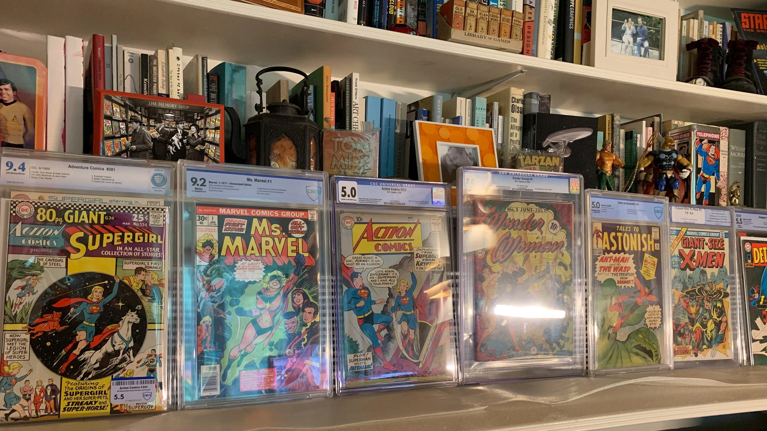
Featured ComiCS
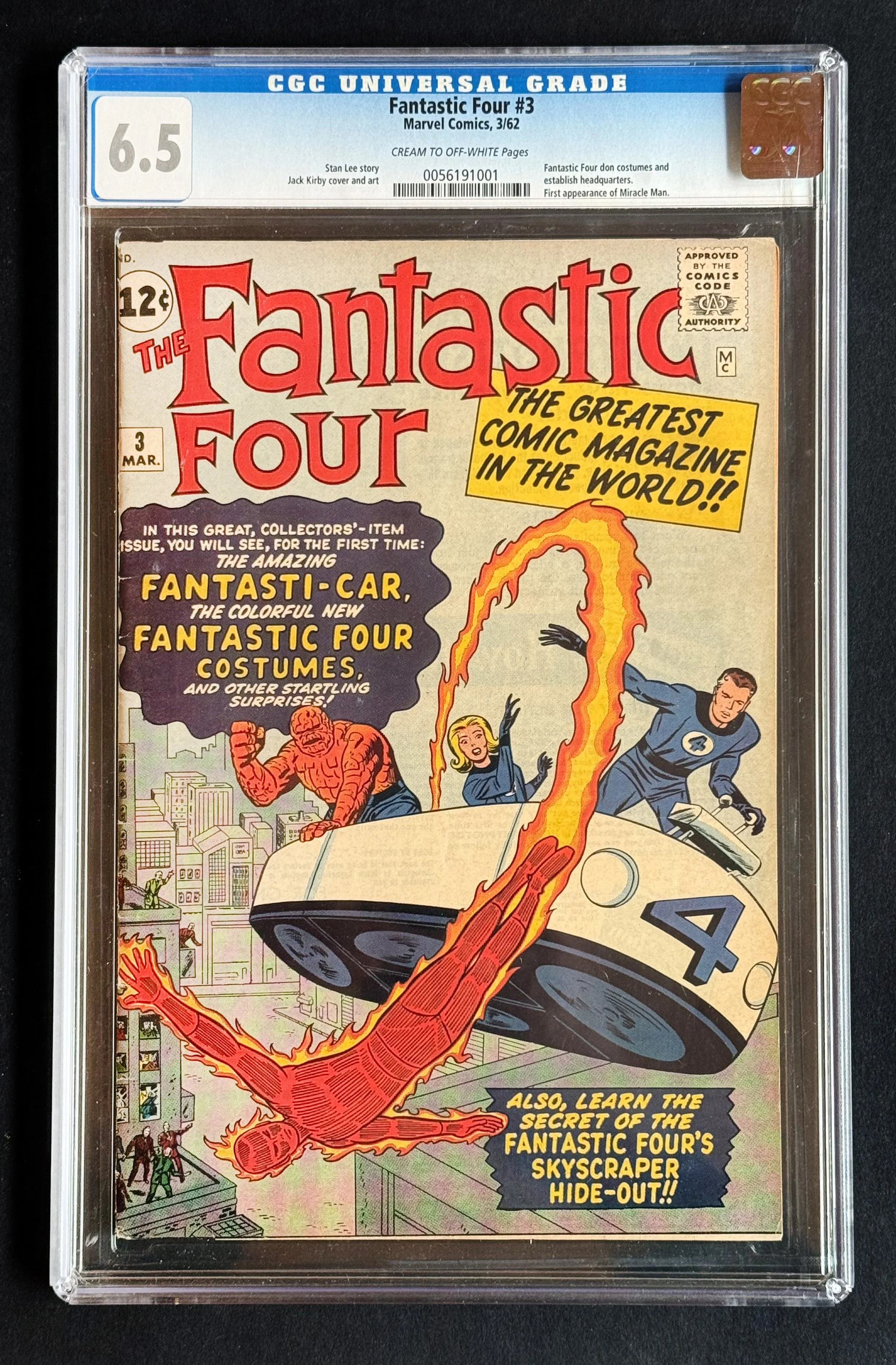
The first two issues introduced them. This is the one where they became themselves. Issue three is when the Fantastic Four put on their costumes, moved into the Baxter Building, unveiled the Fantasti-Car, and declared to the world — and to readers — that something genuinely new had arrived in comics.
Currently #31 on Overstreet’s Top 50 Silver Age Comics list, FF #3 is a foundational key that tends to get overlooked in the shadow of issue one. It shouldn’t be. This is the issue that established the visual and structural identity of the team that Stan Lee and Jack Kirby would build a universe around.
Certified by CGC at 6.5 Fine+ — a clean, presentable mid-grade copy of a 1962 book. With Avengers: Doomsday arriving in December 2026 and the FF at the center of it, the timing for a book like this is only going one direction.
DETAILS
Issue Fantastic Four #3 · Marvel Comics · March 1962
Key 1st appearance of the Fantastic Four in costume
Also features 1st appearance of the Fantasti-Car MK I and the Baxter Building
Also features 1st appearance of Miracle Man
Credits Cover and art: Jack Kirby · Story: Stan Lee
Grade. CGC 6.5 Fine+
Ranking #31 on Overstreet’s Top 50 Silver Age Comics
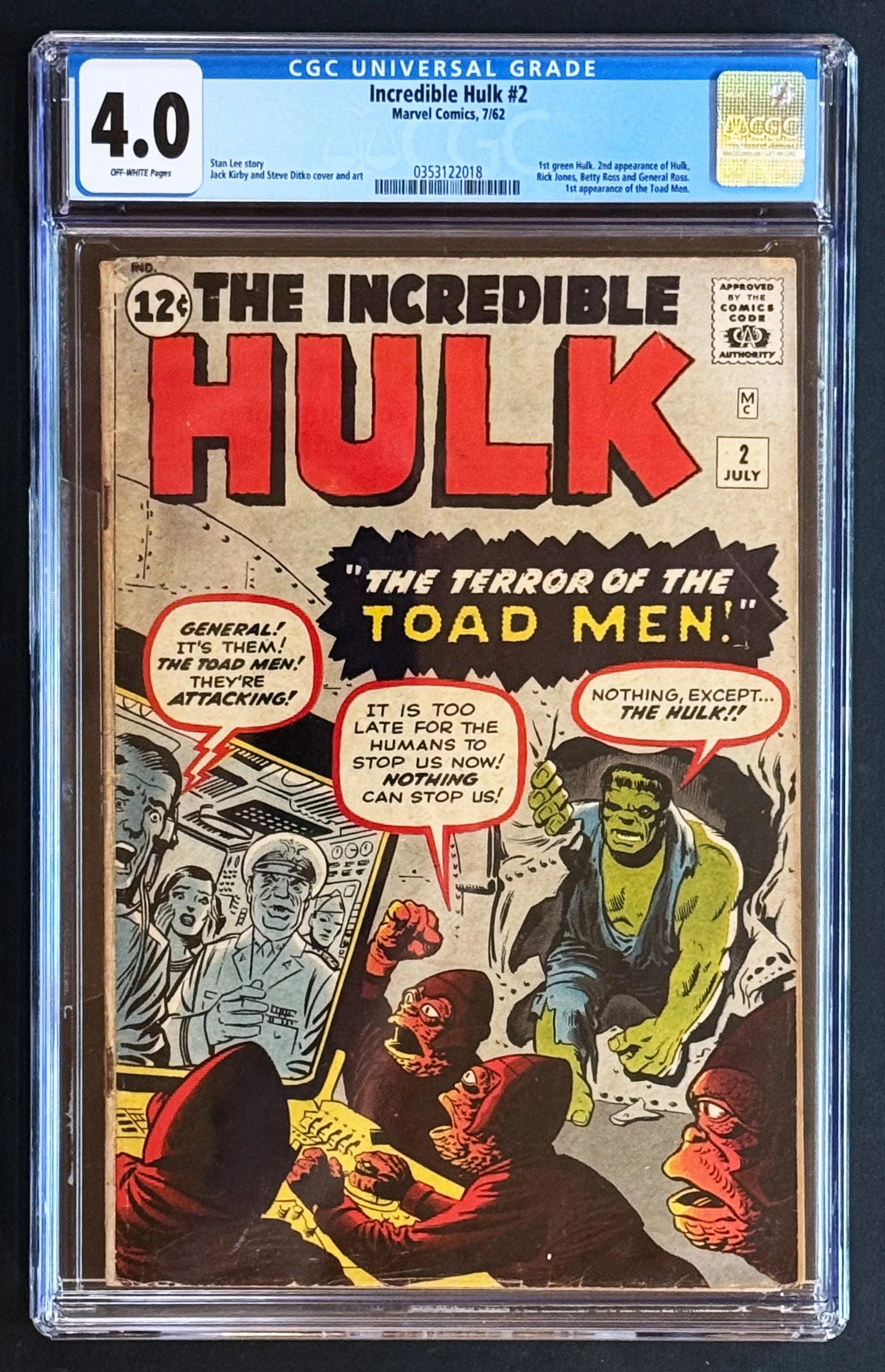
In the first issue, the Hulk was gray. By the second, he was green — and the most recognizable character Marvel would create in the Silver Age had his final form.
The change was practical. Gray ink had printed unevenly in The Incredible Hulk #1, with copies coming off the press in shades ranging from charcoal to nearly silver. Stan Lee and his colorist landed on a green the printers could hit consistently. The decision stuck. Six decades later, the green is non-negotiable — sealed into every cartoon, lunchbox, and Avengers poster ever produced.
Kirby drew the cover and the interior. Ditko inked the cover. The two greatest hands of the Silver Age, working the same book, before anyone fully understood what either of them was about to become.
The story itself — "The Terror of the Toad Men!" — introduces an alien race of mole-faced invaders who never quite achieved the cultural staying power of, say, Galactus. But the book is the book. Second Hulk appearance overall. First green Hulk. First Toad Men. One of Marvel's earliest cosmic-scale stories. Overstreet ranks it among the top thirty Silver Age comics ever published.
What people forget: The Incredible Hulk was canceled after six issues. The character we now consider Marvel's foundational monster spent the rest of the decade as a guest star in Tales to Astonish and a fixture of the Avengers — his solo title a brief experiment that didn't survive its first year. Every surviving copy of issue #2 is an artifact of that vanished run, a fragment of a series Marvel didn't yet know was important.
This CGC 4.0 copy presents honestly. Off-white pages, structurally sound, the cover colors still doing the work Kirby and Ditko intended. The grade reflects a book that has lived through six decades of being loved, not stored. That feels right for a Hulk.
DETAILS
Grade: CGC 4.0 Very Good
Off-white pages
Cert #0353122018
Published July 1962, Marvel Comics
Story: Stan Lee | Cover & art: Jack Kirby and Steve Ditko
Key issue: 1st green-skinned Hulk, 2nd Hulk appearance, 1st Toad Men
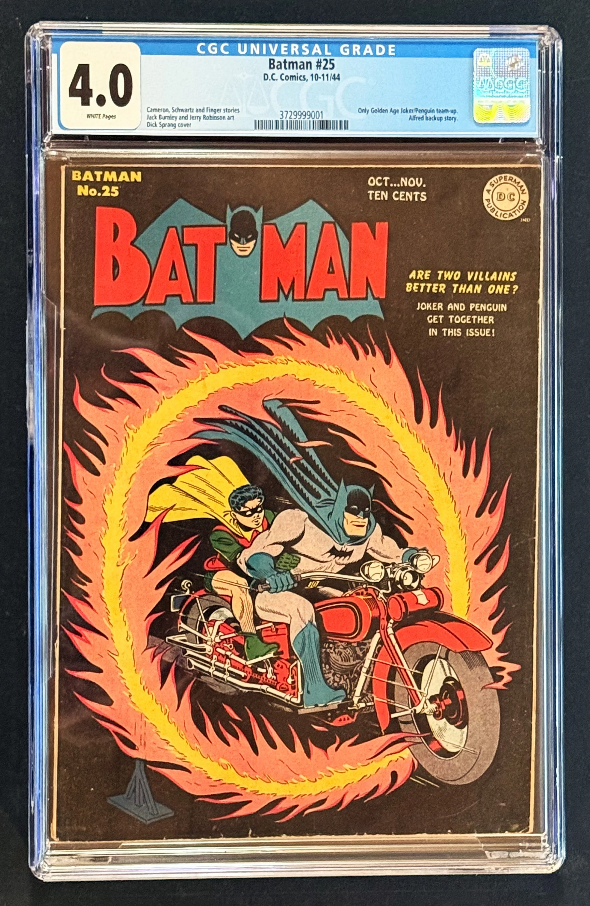
Eighty years ago, DC Comics asked a question on the cover of this issue: are two villains better than one? The answer, as any Batman reader could tell you, is emphatically yes.
Batman #25 contains the only Golden Age team-up of the Joker and the Penguin — the two most iconic villains in Batman’s rogues’ gallery, together for the first and only time in the Golden Age of comics. Jack Burnley and Jerry Robinson handled the interior art, and Dick Sprang — one of the defining Batman artists of the era — delivered the cover. The result is a book that reads as a historical artifact and a genuinely great piece of Golden Age storytelling.
White pages in a 1944 book are exceptional. This CGC 4.0 is a sturdy, well-preserved Very Good copy — honest grade for a book that is over eighty years old and surviving remarkably well. An essential piece for any serious Golden Age or Batman collection.
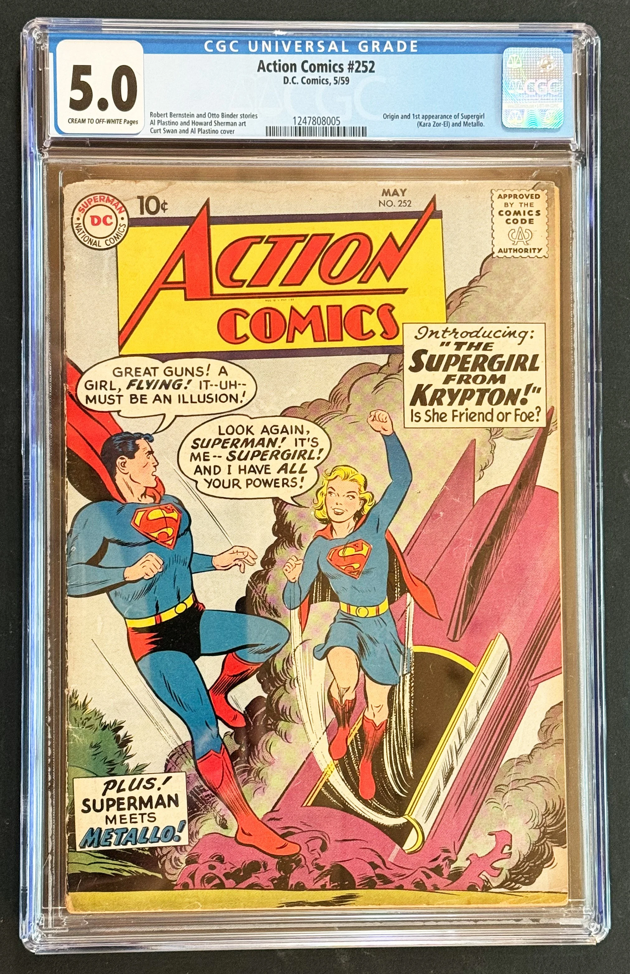
In the summer of 1959, Otto Binder and Al Plastino did something the editors of Action Comics had quietly been building toward for years: they gave Superman a family. Action Comics #252 introduces Kara Zor-El — Supergirl — in a story that hits every note a first appearance should: origin, pathos, wonder, and a dramatic full-cover reveal that left readers no doubt a new character had arrived to stay.
The story is deceptively compact. In seven pages, Binder establishes Argo City's miraculous post-Krypton survival, Zor-El's desperate gamble to save his daughter, and Kara's arrival on Earth with powers equal to her famous cousin's. Plastino's art is warm and accessible in the way only late-'50s DC could manage — clean, bright, enormously readable. The cover, penciled by Curt Swan with inks by Al Plastino, frames the meeting of the two cousins against Kara's crashed rocket with a dramatic simplicity that became one of the era's most reproduced images.
Sixty-seven years later, with Supergirl: Woman of Tomorrow arriving on June 26, 2026, this is the book everyone is looking for. Action Comics #252 is currently ranked #16 on Overstreet's Top 50 Silver Age Comics, and surviving mid-grade copies are genuinely scarce — this was a heavily circulated newsstand title in an era before protective bags and boards were standard practice.
This copy grades CGC 5.0 (Very Good/Fine) with Cream to Off-White pages. It presents solidly for the grade — a real, holdable, readable piece of Silver Age history with a third-party grade to anchor the transaction.
Featured BOOKS

Andrew Zuckerman set out to photograph the world's most celebrated elders — Judi Dench, Desmond Tutu, Nelson Mandela, Stephen Hawking, among many others — against a pure white ground and ask them one question: What is wisdom?
The result is a book unlike most photography books: intimate, direct, and genuinely surprising. Zuckerman's portraits are meticulously lit and composed, each face given the same clean, equal attention. The words beside them are not platitudes. The wisdom here is earned — from lives that have traveled far enough to see things clearly.
Condition: Excellent. Clean boards, tight spine, pages bright and unmarked.
Publisher: Abrams. Photographs and concept by Andrew Zuckerman.
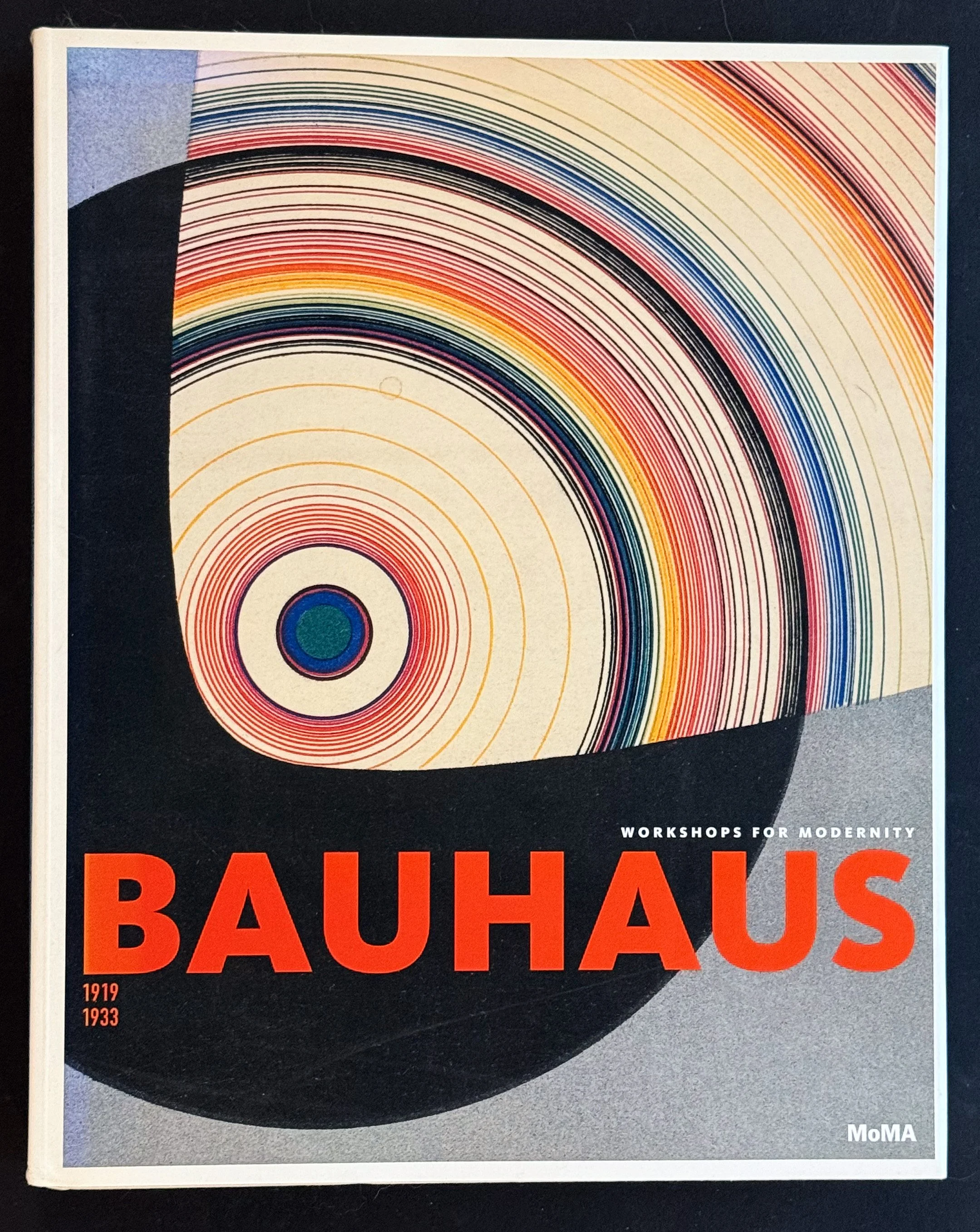
The Bauhaus lasted fourteen years. Its influence has lasted a century and counting.
Founded in Weimar in 1919, dissolved under Nazi pressure in 1933, the school produced a body of work in furniture, typography, weaving, photography, theater, and industrial design that quietly reorganized how the modern world looks. This is the catalogue from MoMA's landmark 2009 retrospective — edited by Barry Bergdoll and Leah Dickerman — and it remains the standard scholarly account of the Bauhaus in English. Not a coffee-table overview but a serious reckoning: workshop by workshop, teacher by teacher, with full-color plates throughout and essays by a team of international scholars.
Condition: Excellent. Clean boards, tight spine, pages fresh and unmarked.
Publisher: The Museum of Modern Art, New York. Editors: Barry Bergdoll and Leah Dickerman.
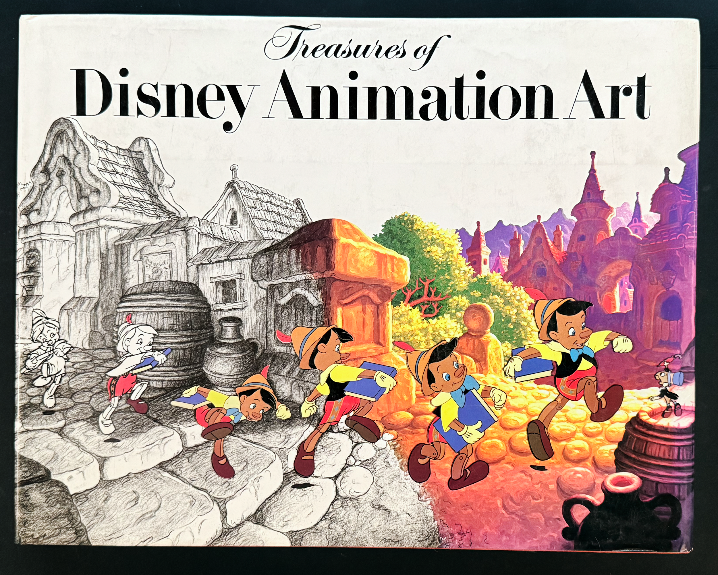
Published in 1982 by Abbeville Press in collaboration with Walt Disney Productions, Treasures of Disney Animation Art is the kind of book that reminds you why the golden age of Disney deserved to be called golden.
This large-format volume draws directly from the Disney archives: production drawings, concept sketches, color models, layout art, and background paintings from the full sweep of the studio’s classic output. Snow White. Pinocchio. Fantasia. Dumbo. Bambi. Cinderella. Alice in Wonderland. Peter Pan. The art reproduced here was never meant to be seen by the public — it was working material, created by animators at the height of their craft before being locked away in studio vaults.
Edited by Walton Rawls and designed by Howard Morris, the book is itself a beautiful object: large enough to do justice to the originals, printed with enough fidelity to appreciate the pencil strokes and color choices that went into every frame.
This is a first edition (third printing), published the year the Disney archives first opened their doors to this kind of scholarly treatment. A foundational reference for anyone serious about animation history or Disney collecting.
This copy shows wear to the spine; interior pages are clean throughout.
Featured ARTIFACTS
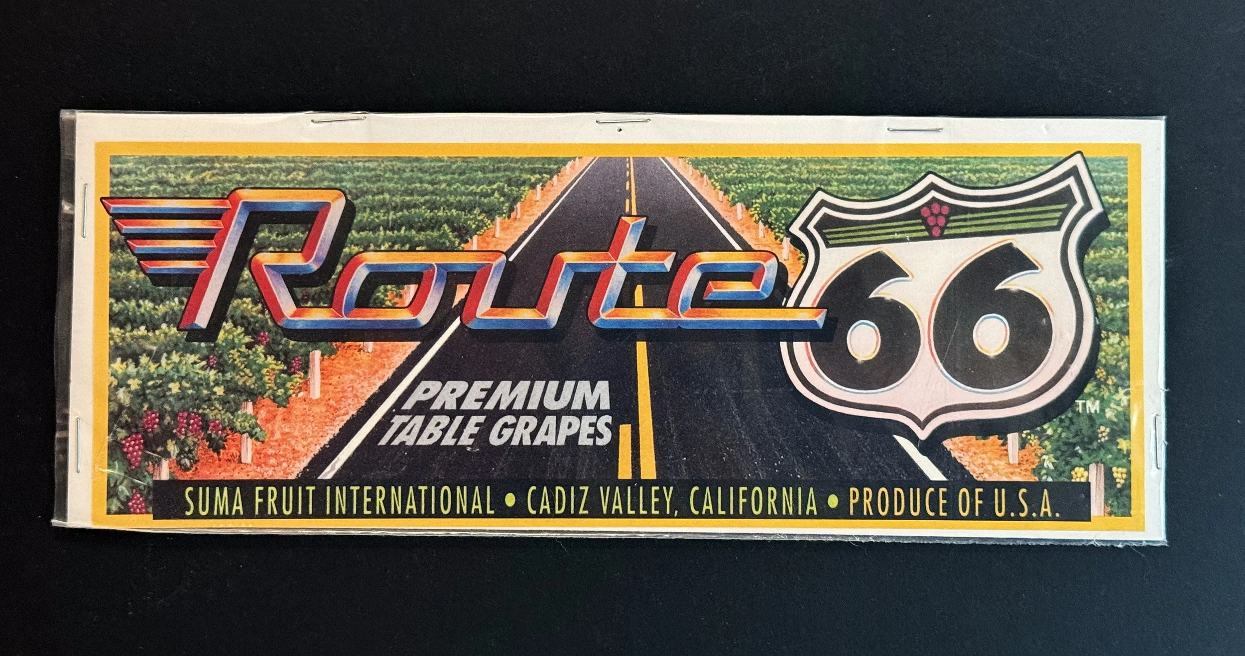
Between the 1880s and the 1950s, American produce crates were rolling billboards. Each wooden box of apples, peppers, cucumbers, or grapes carried a label glued to one end identifying the grower, the brand, and — most importantly — the visual personality of the shipment. The labels were how a Washington apple packer competed with a Florida cucumber operation for the eye of a grocer four states away. They were printed by regional lithographers using stone and metal-plate processes, and the best of them are now recognized as one of America's great folk-art forms: small-format commercial poster art from the era when graphic design was selling fruit out of railcars.
This is a curated set of five unused stock labels — four authentic mid-century pieces and one later revival in the same tradition — representing both coasts of American agriculture:
Cascade Brand Washington Apples — Cashmere Fruit Exchange, Cashmere, Washington. Mid-century. The classic smiling-boy-with-an-apple iconography in deep navy and gold; pure Pacific Northwest apple-country optimism.
May-Belle Brand — G.G. Oldham Inc., Leesburg, Florida. Mid-century. A single oversized cucumber against a dramatic red ground; quiet confidence in the produce itself.
Alongo Brand — M.E. Brown Inc., Bowling Green, Florida. Mid-century. Glossy green bell peppers on a deco-blue gradient with bold drop-shadow typography.
PEP Brand — Nash-De Camp Co., Visalia, California. Mid-century. Modernist sans-serif PEP letters bursting through torn paper in red, white, and blue — pure California optimism rendered as packaging.
Route 66 Premium Table Grapes — Suma Fruit International, Cadiz Valley, California. Later revival design in the mid-century tradition; the road-trip Route 66 mythology applied to a contemporary table-grape brand.
All five are in unused stock condition, individually sleeved in clear protective bags. Suitable for framing as a five-piece typological wall display, collecting in albums, or splitting across a kitchen, mudroom, and study. The horizontal labels are approximately 11 x 4 inches; the vertical labels approximately 9 x 7 inches.
Offered as a set. A small but cohesive cross-section of American commercial graphic design at its most exuberant — and a reminder that for a century, a wooden crate was a canvas.
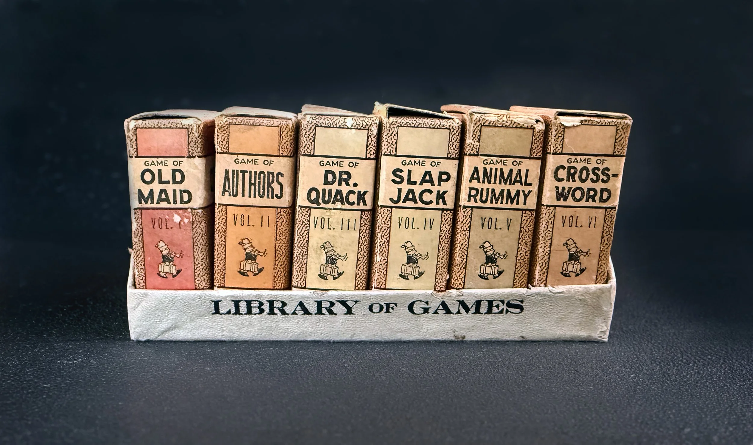
Russell Manufacturing Company of Leicester, Massachusetts spent the better part of the early twentieth century making cards. By the 1930s, they had landed on an elegant retail idea: package six miniature card games as a row of leather-bound "books," slip them into a matching white case printed "LIBRARY OF GAMES" along the front, and sell the whole assembly as a single object. The result looks more like a shelf of pocket-sized novels than a children's toy. Kids loved them. Adults still do.
This is the complete six-volume set in its original slipcase, each "volume" containing a different game in its own book-shaped card box:
Vol. I — Old Maid
Vol. II — Authors
Vol. III — Dr. Quack
Vol. IV — Slap Jack
Vol. V — Animal Rummy
Vol. VI — Crossword
The illustrations on the cards are the real story. Russell's character designers gave these decks a midcentury cheerfulness that has aged into genuine charm: Curly Locks, Miss Muffett, Tomboy Tillie, Bill Pig, Prudy Prim, Big Hop, Bo Peep, Harry Homer. Mistress Mary smells the flowers. Bill Pig contemplates a stolen apple. The little walking bookworm mascot stamped on every spine carries his suitcase down the row.
Condition: Good. The slipcase is sound and graphically intact. The six "volume" boxes show notable wear along the top edges — frayed paper from decades of being slid in and out — but all are present, all hold their cards, and the front-facing graphics remain bright and legible. All six decks appear complete; the Old Maid cards are photographed in detail for reference. A working set, not a museum-grade specimen.
A piece of working-class American design from a country that briefly thought a children's card game should look like a library.
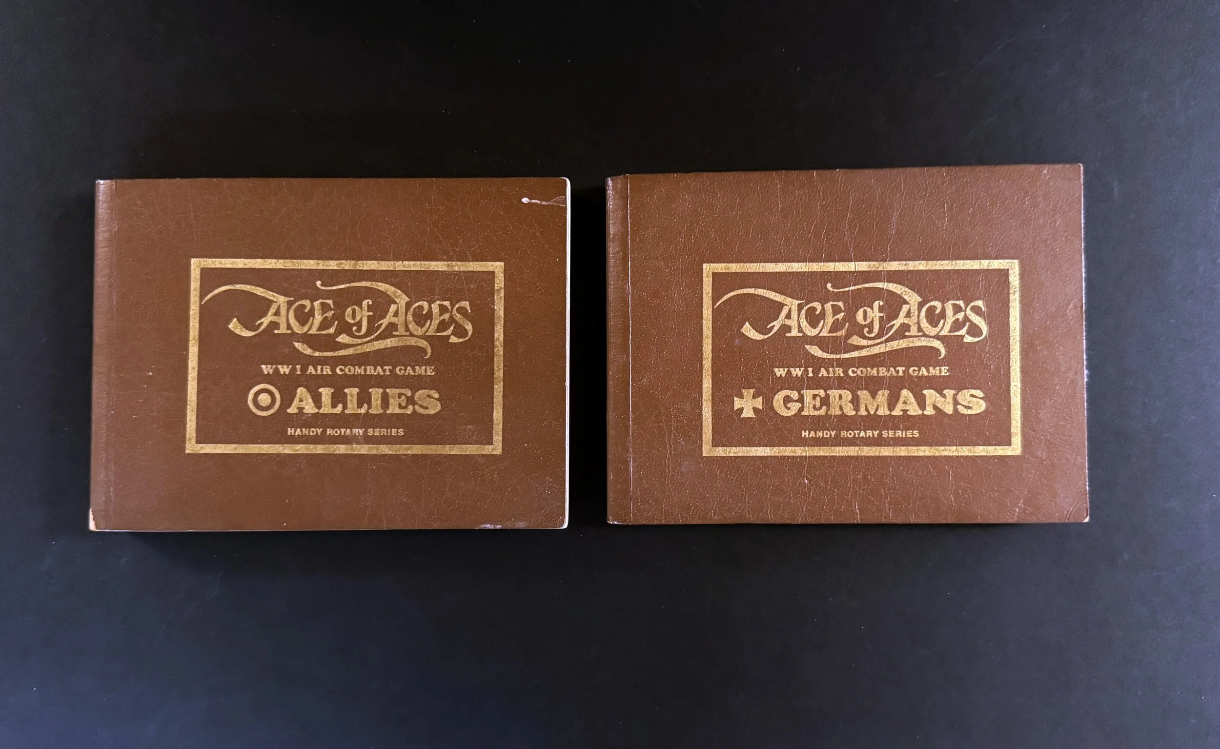
In 1980, a Massachusetts middle-school history teacher named Alfred Leonardi published one of the most ingenious tabletop war games ever designed. Ace of Aces: Handy Rotary Series turned WWI dogfighting into two leather-bound flip books. No dice. No board. No counters. Just two pilots facing off across a kitchen table, each looking at their own private view through the cockpit, each picking a maneuver, each calling out a page number to their opponent. Cross-reference, flip, repeat. The plane in your sights is the plane in his.
The system was so elegant that Leonardi patented it — the first patented game system in history, predating Wizards of the Coast's collectible-card-game patent by over a decade. It won the 1980 Charles S. Roberts Gamers' Choice Award and was inducted into the Origins Awards Product Hall of Fame in 1993. Variations followed across the eighties and nineties — Powerhouse, Flying Machines, and Balloon Buster for WWI; Wingleader for WWII; Jet Eagles for modern aircraft; eventually fantasy and Star Wars adaptations — but the original Handy Rotary set is the foundational pair where all of it began.
This is exactly that pair: Allies (the Sopwith Camel pilot's perspective) and Germans (the Fokker Dr.I pilot's perspective), bound in the original brown faux-leather covers with gold-foil stamping. Together they make a complete playable set — a self-contained two-player war game in two slim volumes that fits in a coat pocket.
Condition: Very Good. Both covers show light wear and rubbing to the gold-foil titling, with one small corner chip on the Allies volume. Interior pages clean, complete, and bright. Spines tight. Fully playable.
A foundational artifact for game collectors, aviation enthusiasts, or anyone who recognizes elegant design when they see it. Currently being reprinted by Mr. B Games via Kickstarter — but originals from the 1980 Nova Game Designs printing remain the collector's preference.
About the Memory Shop
I've spent more than fifty years collecting artifacts of the stories, characters, and worlds that inspire me — comics, science fiction, film, television, genre fiction, games, toys, and more. What began as wonder became fascination, which then became a lifelong pursuit.
The Memory Shop of Concord is the result of that lifelong engagement — a place where every object is chosen for what it means, not just what it's worth.
These are things that once sparked imagination. And still can.